If your dispatch dashboard in Google Sheets is getting messy, you usually don’t need a new dispatch platform. You need tighter rules for what creates a row, consistent formatting at the point of entry, and a couple of simple dashboard KPIs (like live wait time) so drivers can see what’s pending at a glance.
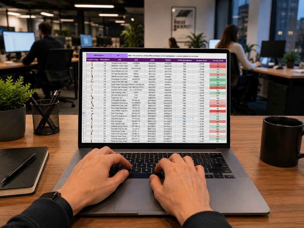
Google Sheets dispatch dashboard wait time and ETA tracking at a dispatch desk. Photo by BaljkanN4 on Unsplash
1) Stop outbound calls from creating extra rows (row-creation rules)
When every phone action can create a record, dashboards get cluttered fast. Fix this by defining a single “row creation event” and making everything else update the existing row.
Pick one row-creation trigger and stick to it:
Inbound call only (most common): only create a new row when an inbound call is answered (or after it’s missed).
New request submitted (best when you have a form or agent script): only create a new row when someone submits a request (pickup/destination/party size).
Manual dispatcher entry (fallback): dispatcher clicks a button/shortcut to “Create new request.”
Then make outbound calls update, not create:
Give each request a unique ID (timestamp + caller number, or your CRM record ID).
Store that ID in a dedicated column (e.g., Request ID).
On outbound calls, run a “find row by Request ID” step first, then update that row.
If you’re using a business phone system plus an automation platform (for example, Zapier), the pattern is the same: create the record once, then update that same record as the call progresses.
Quick checklist: what to verify
There is exactly one “create row” path
Outbound calls use a “lookup row” step before any “create row” step
The automation includes an idempotency key (Request ID) stored in the sheet
2) Standardize text + data formatting at the point of entry
A dispatch sheet breaks down when the inputs are inconsistent (e.g., “airport” vs “Airport,” mixed phone formats, or pickup notes merged into one long blob). Fix this before the data lands in the sheet.
Create a normalization layer:
Trim leading/trailing spaces
Replace repeated whitespace with single spaces
Convert to consistent case (e.g., Title Case for names, UPPER for short codes)
Strip non-printing characters
Normalize phone numbers to one format (E.164 if you can)
Split “human notes” from “structured fields”:
Put pickup address, destination, party size, and requested time in separate columns
Keep freeform notes in a single Notes column, but don’t let it replace structured data
Add guardrails inside Google Sheets:
Data validation for key columns (status, pickup zone, driver assigned)
Dropdowns for status values (no free-typing)
Conditional formatting that highlights missing fields (e.g., destination is blank)
If you’re already using Google Sheets as the live dashboard, think of the sheet as a read model: the clean, standardized version of reality. Do the messy parsing upstream.
3) Make “pending requests” visually obvious (driver glance test)
If a driver can’t look at the sheet and immediately answer “what needs action?”, the dashboard isn’t doing its job.
Use a minimal status model:
New
Pending driver
Assigned
Picked up
Completed
Canceled
Add two columns that make the board self-explanatory:
Driver Assigned (blank = needs attention)
Next Action (short text like “Call back”, “Assign driver”, “Confirm pickup time”)
Conditional formatting rules that matter:
Highlight rows where Status = New and Driver Assigned is blank
Fade rows where Status = Completed or Canceled
Use one “urgent” color only (save red for true exceptions)
4) Add a live wait-time display (simple + reliable)
A live wait-time display is one of the most useful KPIs for dispatch operations because it’s immediately actionable.
Recommended columns:
Request Created At (timestamp)
Now (a cell with =NOW()). By default this only recalculates when someone edits the sheet, so set File → Settings → Calculation → Recalculation to “On change and every minute” for a live clock (as of October 2026)
Wait Minutes (difference between Now and Request Created At)
Make wait time readable:
Bucket it with a label column:
0–5 min, 5–10, 10–20, 20+
Use conditional formatting to color buckets (green → yellow → orange → red)
Avoid fragile formulas:
Keep complex logic out of the main grid
If you need more calculation, move it to a helper sheet and reference it
5) ETA estimates: start with “good enough” before “perfect”
ETAs are tempting but hard to do well without historical data and consistent timestamps. Start with a basic model and improve it as you collect data.
A practical first ETA model:
Estimate pickup ETA based on:
current backlog (count of New + Pending driver)
average handling time (use a simple historical average)
Display ETA as a range (e.g., “10–20 min”), not a single number
What you need to collect to improve ETA accuracy:
request created time
driver assigned time
pickup time
completion time
cancellation reason (optional)
Once those timestamps are consistently captured, you can iterate toward better predictions.
6) A clean dispatch dashboard implementation plan (1–2 hours)
If you want to tackle this quickly, here’s a tight sequence that usually works:
Lock row creation: one path creates rows; everything else updates.
Add Request ID: ensure every automation step uses it.
Normalize fields: trim, split, and validate inputs upstream.
Add status + next action: make the dashboard readable.
Add wait time KPI: use created time → bucketed wait minutes.
Log timestamps: begin collecting the data you’ll need for ETAs.
Get help building your dispatch dashboard
We build Google Sheets dispatch dashboards and the Zapier automations that feed them, so drivers see one clean row per request with live wait times. If your sheet is getting messy, book a free consulting call and we’ll map out the cleanup with you.
Automate monthly Salesforce exports from S3 + Google Sheets: pull daily files from S3, calculate member status in Sheets, and generate a weekly CSV in Drive.
Learn how to automate Full Enrich to Pipedrive contact enrichment using Zapier, Make, or n8n. Get the field map, safeguards, and step-by-step workflow.